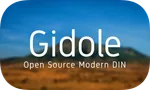
7 Questions With Andreas Larsen
An interview with the designer of Gidole, the font we're currently using on our site.
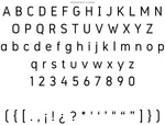
When we set about to give this site a refresh we looked into several different fonts. Exploring the GitHub Font showcase we stumbled upon Gidole. We really liked the crisp and clean look, that it was open source, and free to use.
In return the font creator is asking users to make a donation to the Ethiopian Red Cross Society. That nailed it for us, as two of our products (Collaborate and LegalServer) each focus on helping non-profits do business efficiently.
Gidole is designed by Andreas Larsen. We shot him a couple questions to find out more about the font, his charity and other projects.
What’s your thoughts behind designing Gidole?
I’ve always had a thing for typography and liked DIN for it’s geometric simplicity but often felt it was a bit too “mechanical” and that other modern fonts drawing inspiration from it – such as e.g. Roboto and San Francisco still were too unfriendly.
I’m a big fan of the ultra legible Clear Sans with it’s slightly narrow letters and generous apertures (the opening at the end of an open counter in letters such as e.g. “a” and “e”).
What was your process for designing Gidole?
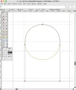
I started drawing curves around circle using Illustrator but quickly started using the open source font editor FontForge.
Gidole was my first font and I having no design education I quickly turned online for feedback. Some friendly people at typophile helped a lot, then later on /r/typography and now mainly on issues on GitHub.
My initial sketch looked like this:
The hardest parts of the design process was getting the curves and curve-to-straight-transitions just right. Switching to Euler spirals instead of bezier curves in FontForge made it a lot of that easier. Image is screenshot of the backbone of the letter h drawn using spiral mode where you don’t have to mess with handles but simply select different point types (curve point, tangent point, corner point etc).
Why did you decide to open source the font?
For multiple reasons. I had previously made themes for jailbroken iOS that I made as donationware and it raised quite a bit of money to charitable organisations so I wanted to try that again and set up a donation page for Gidole. I also wanted to learn as much as possible and experts are more inclined to help an amateur. I’m using open source software, fonts, graphics etc. daily so it’s also a sense of giving back to the great online community.
What’s the story behind the name?
It’s the name of the small city where we lived in Ethiopia for 4 years when I was growing up. I have many happy memories from Gidole and it was simpler times - which is somewhat the same emotions I’m trying to invoke with the font: simplicity and friendliness.
Have you released other fonts and are there any new ones in the pipeline?
I made Monoid last year. It shares many design features with Gidole and was an experiment in combining the best of qualities of bitmap and vector fonts for coding. It has ligatures, contextual letter-spacing and other weird stuff. It’s also open source and very well received. Fastcompany wrote about it and it’s one of the default fonts on CodePen.

I’m currently improving Gidole (perfecting some characters and spacing) and adding more characters to it (greek, russian, vietnamese and more). I also hope to be able to add more weights and styles.
I also want to make a Gidole inspired interpretation of the ~282 fidels that are used to write amharic. So far I’ve only drawn the first letter in my name እንድርያስ but I hope to complete the entire script this year. Something similar hasn’t really been done before so we’ll see where it ends up.
I use my Twitter @larsenwork for project updates.
In your opinion what qualifies as a good looking font and who are some of your opening fonts and font designers?
A font should look effortless so that it doesn’t distract from it’s main purpose: to enable reading.
These are some of my favourite:
- Open source fonts: Fira, Clear Sans and Source Sans Pro.
- Commercial fonts: FF Real, FF Mark and obviously DIN.
- Designers: I don’t follow the type design scene that much but love the designs of the late Adrian Frutiger and follow Erik Spiekermann on Twitter.
Besides fonts what are some other things you have released and are working on?
This Christmas I optimised most social icons for online use using techniques from font design to reduce the file sizes by up to 85% and put it up on GitHub as social.svg.min.

This spring I hope to finish the desktop app for animalnoteheads (also open source) so it’s easy to create new sheets and kids/toddlers everywhere can learn musical notation in a fun and easy way.

I have many ideas but time is somewhat limited as I’m also working as a full time web/iOS designer/developer and spending quite some time learning coding languages, frameworks and platforms.
Date
Reading Time
6 minutes
Previous article
Ryan Shay Ninja SpotlightNext article
LegalServer 2016 Training CalendarCategory
Are you a developer? We’re hiring! Join our team of thoughtful, talented people.